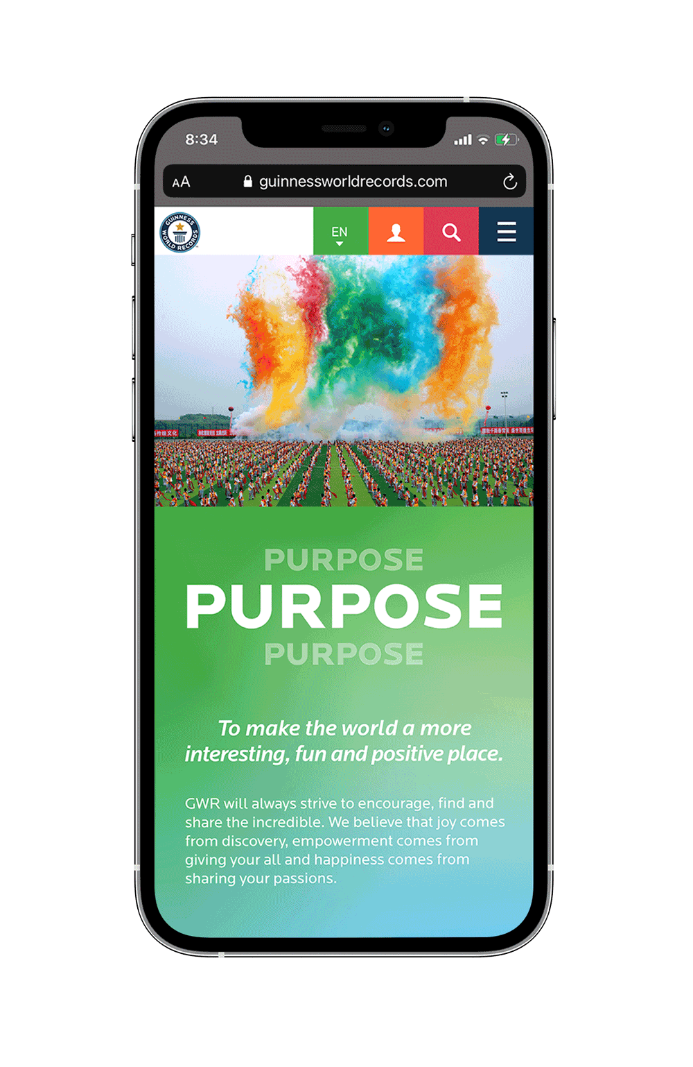
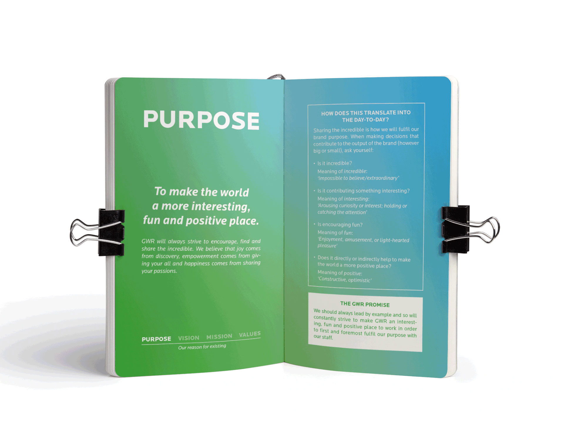
Guinness World Records' purpose, vision, mission and values statements were due for a redesign this year. Previous version featured images of record holders, which now felt dated. With "fun" being added to the list of values, the new design needed to be more lively and colourful. This new design utilises the secondary brand colour palette, blended into a gradient, and bold typography for a more modern look. It has been applied in multiple ways, e.g. website (image below left), notebook for staff (image below right) and office wall graphics.
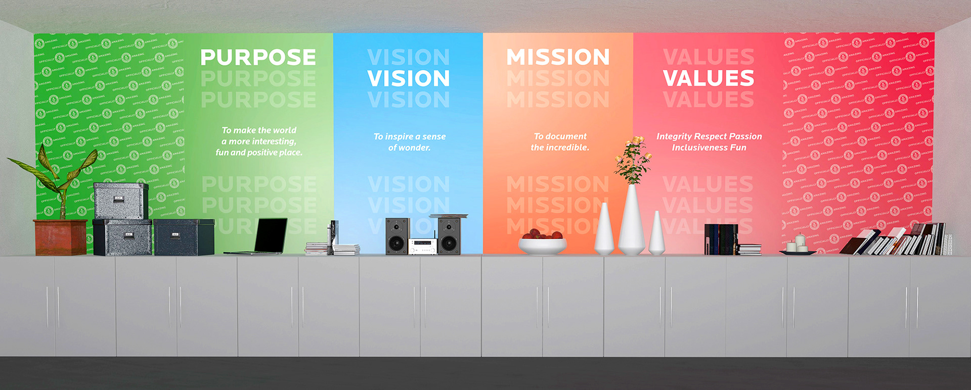
3D visual of the wall graphics for the office in China. As the wall is made up of 6 separate panels (with visible division lines) it felt more appropriate for the space to have each panel as a single-tone gradient instead of all colours being blended together.